Generations of Americans are accustomed to the food pyramid design, and it’s not going away. In fact, the Healthy Eating Pyramid and the Healthy Eating Plate (as well as the Kid’s Healthy Eating Plate) complement each other.
Consumers can think of the Healthy Eating Pyramid as a grocery list:
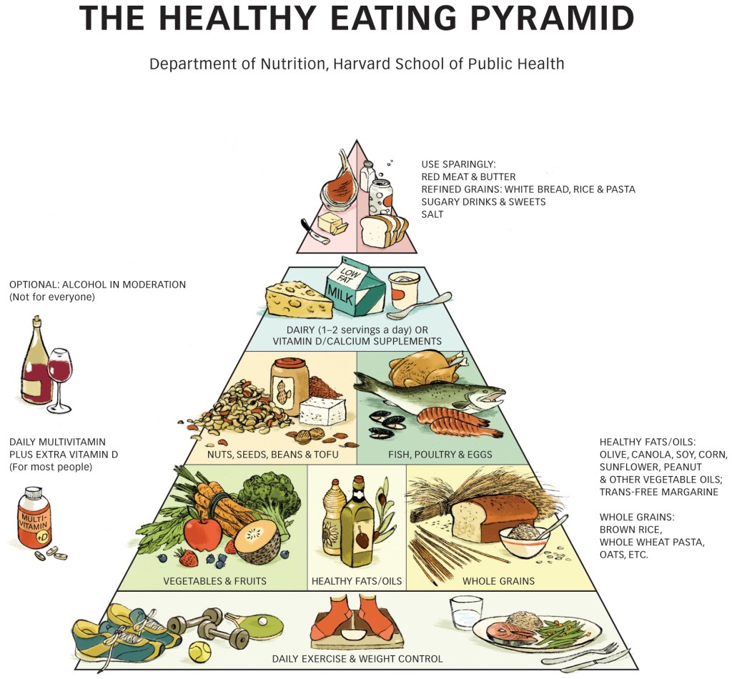
The Healthy Eating Pyramid also addresses other aspects of a healthy lifestyle—exercise, weight control, vitamin D, and multivitamin supplements, and moderation in alcohol for people who drink—so it’s a useful tool for health professionals and health educators.
The Healthy Eating Plate and the companion Healthy Eating Pyramid summarize the best dietary information available today. They aren’t set in stone, though, because nutrition researchers will undoubtedly turn up new information in the years ahead. The Healthy Eating Pyramid and the Healthy Eating Plate will change to reflect important new evidence.
A look back: Problems with the Food Guide Pyramid and MyPyramid
Translating nutrition advice into a colorful pyramid is great way to illustrate what foods make up a healthy diet. The shape immediately suggests that some foods are good and should be eaten often, and that others aren’t so good and should be eaten only occasionally. The layers represent major food groups that contribute to the total diet. The problem with the US government’s original Food Guide Pyramid, released in 1992, was that it conveyed the wrong dietary advice. And MyPyramid, its 2005 replacement, was vague and confusing.
With an overstuffed breadbasket as its base, the Food Guide Pyramid failed to show that whole wheat, brown rice, and other whole grains are healthier than refined grains. With fat relegated to the “use sparingly” tip, it ignored the health benefits of plant oils—and instead pointed Americans to the type of low-fat diet that can worsen blood cholesterol profiles and make it harder to keep weight in check. It grouped healthy proteins (fish, poultry, beans, and nuts) into the same category as unhealthy proteins (red meat and processed meat), and overemphasized the importance of dairy products.
MyPyramid, unveiled in 2005, was essentially the Food Guide Pyramid turned on its side, without any explanatory text. Six swaths of color swept from the apex of MyPyramid to the base: orange for grains, green for vegetables, red for fruits, a teeny band of yellow for oils, blue for milk, and purple for meat and beans. The widths suggested how much food a person should choose from each group. A band of stairs running up the side of the Pyramid, with a little stick figure chugging up it, served as a reminder of the importance of physical activity.
According to the USDA, MyPyramid was “designed to be simple,” and to drive people to the USDA’s MyPyramid website where they could get more details. Unless you took the time to become familiar with MyPyramid, though, you would have no idea what it meant. Relying on the website to provide key information—like what the color stripes stand for and what the best choices are in each food group—guaranteed that the millions of Americans without access to a computer or the Internet would have trouble getting these essential facts.
Permission of use
The Healthy Eating Pyramid image on this Web site is owned by Harvard University. It may be downloaded and used without permission for educational and other non-commercial uses with proper attribution, including the following copyright notification and credit line:
Any other use, including commercial reuse or mounting on other systems, requires permission from the Department of Nutrition at the Harvard T.H. Chan School of Public Health. Please contact us to request permission.